Kora Coffee Branding
Brand Identity
Packaging
Merchandise
Signage
Overview
The Challenge
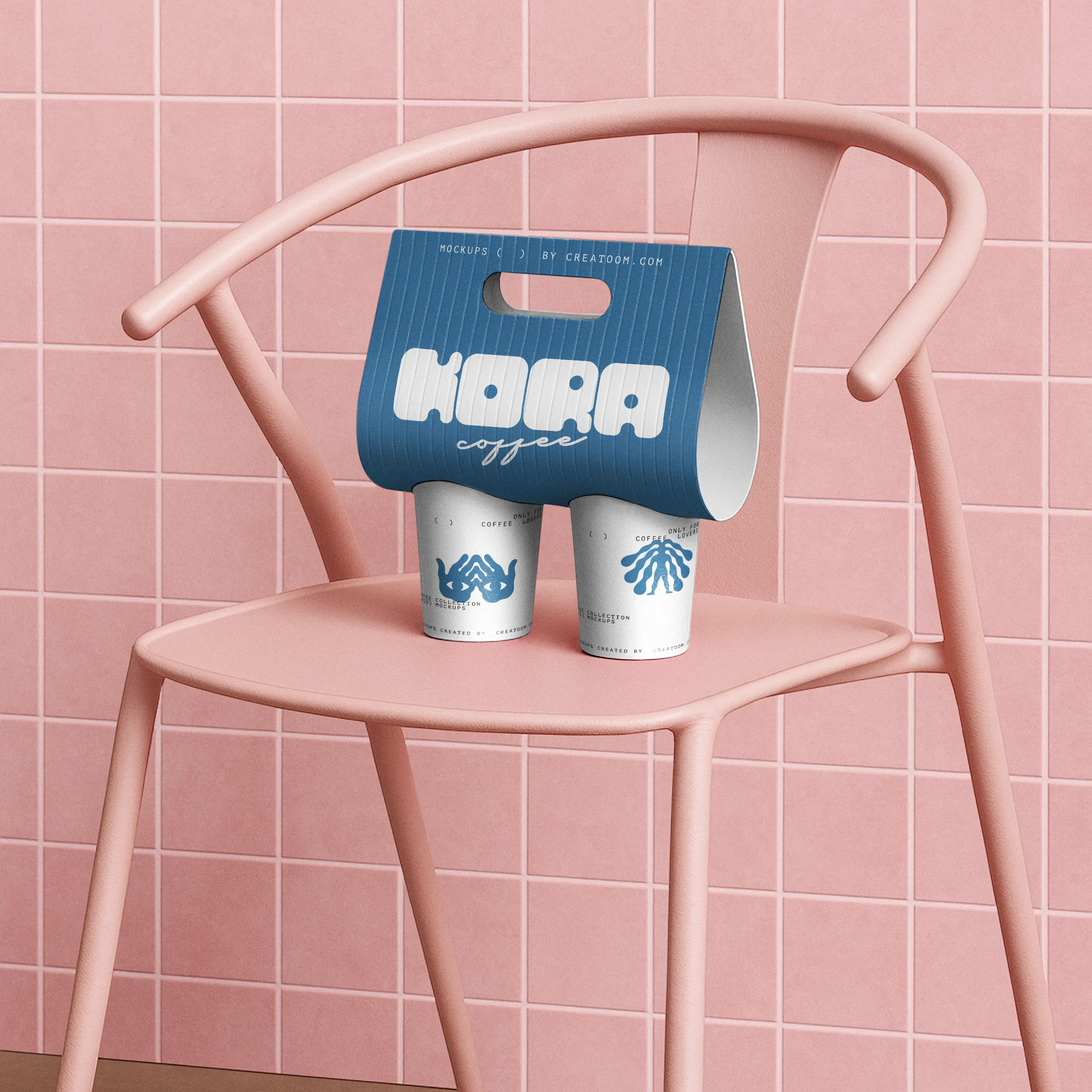
Kora’s owners wanted something people would carry out of the shop: on a cup, a tote, a T-shirt. Their first logo, a thin script, disappeared on anything smaller than the sign.
The Solution
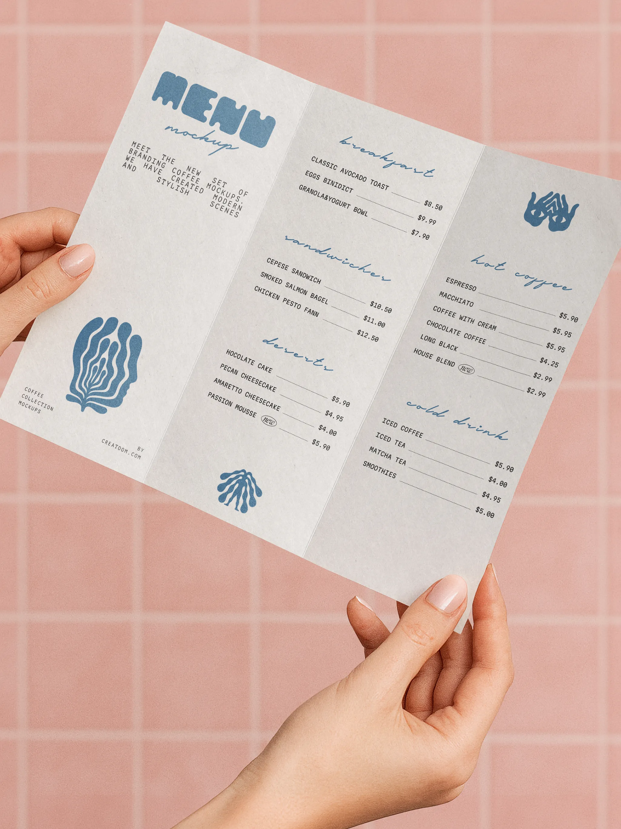
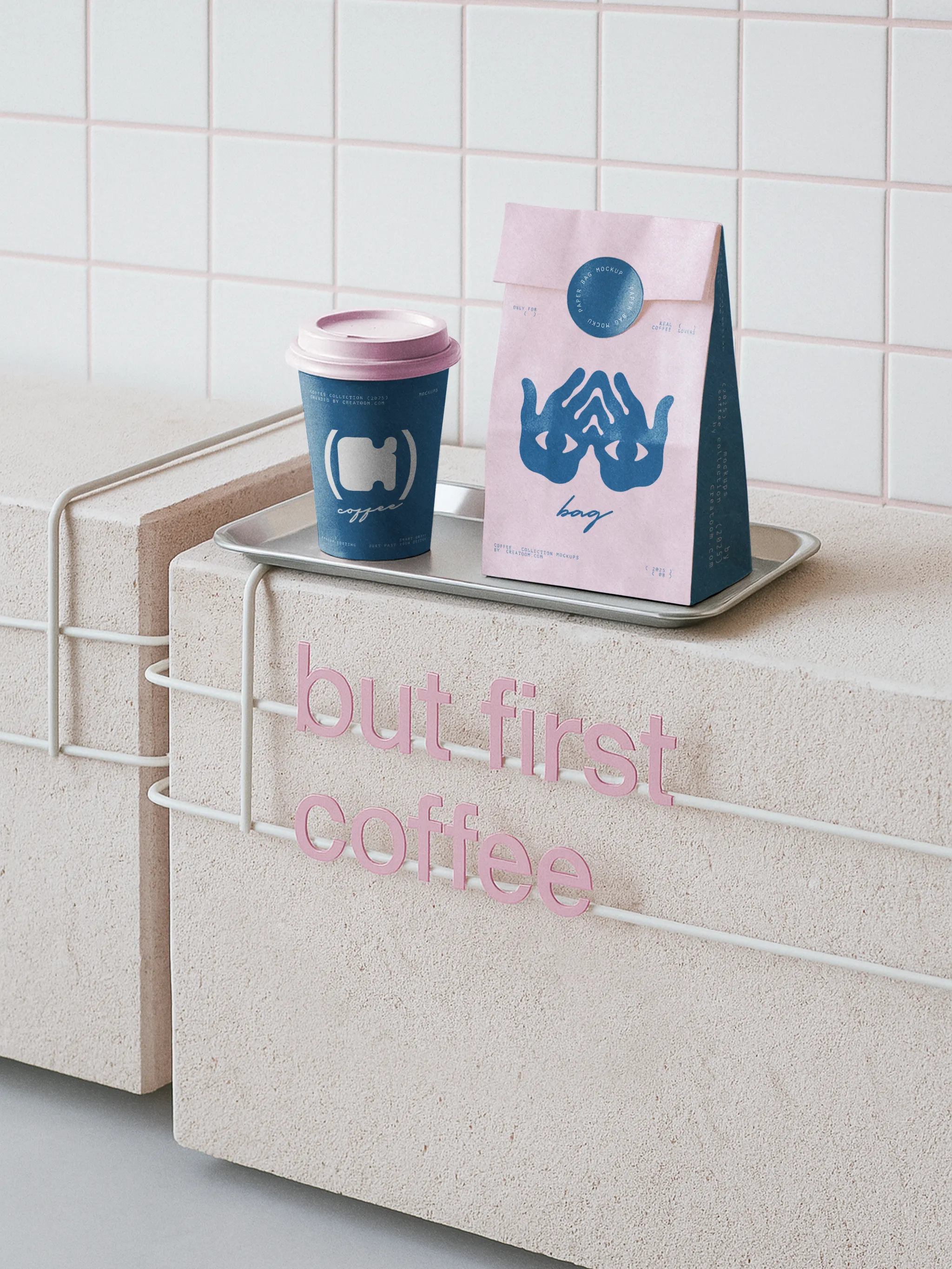
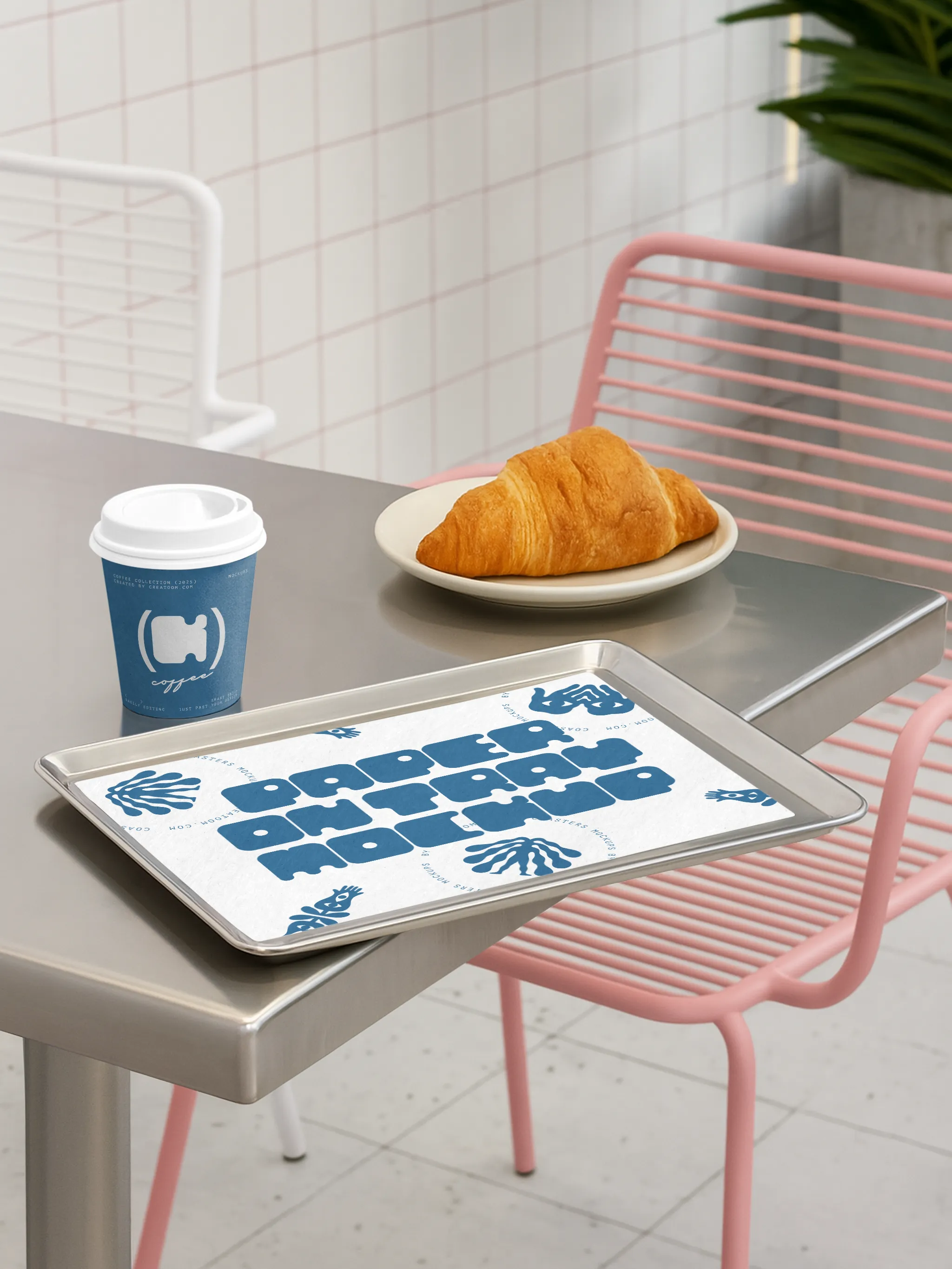
We drew a heavy, rounded wordmark that survives a coffee-stained cup sleeve and a one-colour screen print. The symbol, two hands around a cup, works on its own for stamps, coasters and stickers.
One blue on white or pink keeps print runs cheap and makes every item recognisable from across the street.
Key Highlights
Wordmark legible at 12 mm on cup lids
One-colour system for cups, bags, merch and awning
Symbol designed for stamps and stickers